Table of Contents
Critical chain is one (of many) suggested principles for project management that actually makes some sense in the meaning that it tries to take into account both the human aspect of making time estimates (it is difficult) as well as the different constraints put upon (for example) a SW project. Such constraints are typically that there are only two persons with the knowledge to do task X or that task Y has never been done before and therefore is almost impossible to estimate correctly.
Since this manual has no intention to serve as an introduction to full critical chain project management (CCPM) we will not dwell on the finer details instead we will take out one particular part, or rather a tool, that is one of the fundamental ways of keeping track of a projects using CCPM. The buffer penetration chart.
Even though CCPM in general might not be of interest to the reader the particular graph we will create is s good way to show how to think "out-of-the-box" in creating some graphs with the this library. So it is fully possible to read this case without understanding the underlying methodology.
The graph we will create makes use of ( among other things)
Filled area graphs combined with scatter plots
Showing how to modify the default fill behavior (from the x-axis)
Showing how to disable the 0-labels
Adjusting the display depth for grid lines (and changing the styler of grid lines)
Using different colors on individual scale labels
How to create a custom graph class that can be reused
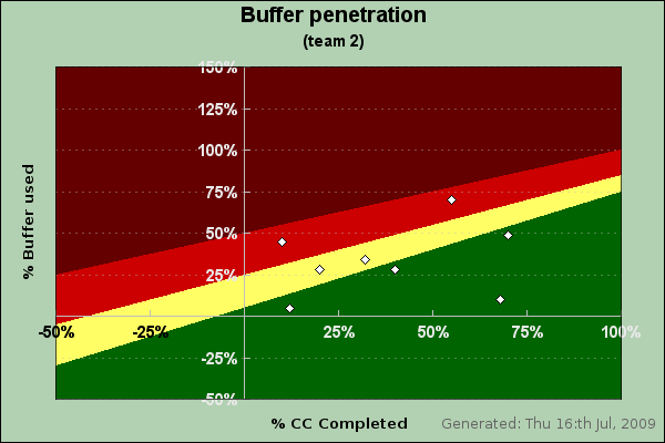
Figure 31.1 shows a typical example of what we will accomplish by the end of this case study
Figure 31.1. Critical chain buffer penetration. Each white scatter dot represents the state of one task.
While not strictly necessary in order to create the graph the following crash course on buffer penetration might help see the usefulness of these types of charts in large projects.
Note
Those wanting to know more about Critical Chain planning are referred to the book and online references at the end of this chapter, see [1] Critical chain Project Management, 2ed, Lawrence P. Leach and [2] A Guide to Implementing the Theory of Constraints, K. J. Youngman, .
To understand the principles of this graph we need to shortly discuss how task (time) estimation is done using the CC methodology. Time estimation for a task is divided in two parts; 1) the optimum time and 2) the contingency buffer. Together they will make up the allocated time for a task. On average each task is expected to make use of some of the contingency buffer (typically as much as 50-75%).
This might seem very strange for people with experience with other methodologies where use of contingency time is an indication of some kind of failure. However, that is not the case in CCPM. The usage of (some) of the allocated buffers are expected. This comes from the way the buffer and the "optimum" time are estimated. The optimum time is a 50% estimate, meaning that the task is only expected to be able to go that fast in 50% of all the times the task is performed. Hence a very optimistic estimate. With the contingency buffer added the estimate should correspond to a 90% estimate, i.e. in 90% of the times the task is performed it will finish within this time.
The graph in Figure 31.1 is a way to visualise the status of an entire project in terms of buffer penetration. The x-axis shows how much of a particular task is completed and the y-axis shows how much buffer up to now have been used. Another way of viewing this is to show how far off the optimum 50% time estimate for the task we are in practice.
The different colored background is a "health" monitor for the tasks. As long as a task is in the green area that task is not in the focus for corrective actions. However as the task moves from green through yellow and into the red this is a signal that immediate actions are needed to secure the end delivery time. If a task has gone into the dark red (or brown) area this is an indication that corrective actions are probably not going to help and a re-planning of the task (and potentially the project is needed). Hence we do not want any tasks in the brown area!
The exact limits for what is considered "green", "yellow" and "red" varies depending on the context and to some degree the flexibility and size of the team but the default values shown above represents a fairly average limits that have been shown to be useful indicators across several industries.
The final key to why this works fairly well in practice is that each team member only have to report one figure in order to track the progress he or she is making and that is how much time more he or she will need to complete the task. Since we now at what day the team member made the estimate we have all the information we need in order to update the plans to see how well we are tracking the original plan.
With the CC methodology we do not bother looking in the mirror and asking the team member to estimate how much of the task he or she has done because that is really irrelevant. The only key figure we need to complete the project on time is to how much more effort/time is needed from the team member. How much of the task has been completed can easily be calculated by knowing how much time is left and compare that with the original estimate. For example, if the original estimate was12 days and the team member at a particular day estimates that he/she has 10 days left we can say that we have completed (12-10)/12 ~ 17% of the task.
This also explains how it can come that we could get negative completion. This is just an indication that the original estimate was too low. For example if the task was originally estimated to 12 days and at a particular day the team member estimates that he/she will need at least 16 more days to complete the task the completion % would be (12-16)/12 ~ -33%
An example will illustrate how this works.
Example 31.1. Buffer penetration example
Assume we have one task that has a 50% estimate of 6 days and a buffer of 5 days (indicating the volatility in the 50% estimate). The following table shows how much time left the team member estimates he has at the end of each working day. This single number allows us to compute (in relation to the original estimate) how much of the task is completed and how much buffer the member has used.
| Day |
Est. time left (days) |
Completion % |
Buffer penetration (days) |
Buffer penetration (%) |
|---|---|---|---|---|
| 1 | 5 | 0 | 0 | 0 |
| 2 | 5 | (6-5)/6 ~ 17% | 1 | 1/5 = 20% |
| 3 | 5 | (6-5)/6 ~17% | 2 | 2/5 = 40% |
| 4 | 5 | (6-5)/6 ~ 17% | 3 | 3/5 = 60% |
| 5 | 4 | (6-4)/6 ~ 33% | 3 | 3/5 = 60% |
| 6 | 3 | (6-3)/6 ~ 50% | 3 | 3/5 = 60% |
| 7 | 2 | (6-2)/6 ~ 67% | 3 | 3/5 = 60% |
| 8 | 1 | (6-1)/6 ~ 83 % | 3 | 3/5 = 60% |
| 9 | 0 | (6-0)/6 = 100% | 3 | 3/5 = 60% |
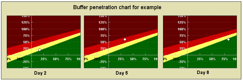
The following three (small) buffer penetration diagram shows how the task at end of days 2,5 and 8
Figure 31.2 hows a fairly typical (albeit not ideal) progress for a task. It gets a rocky start, has some problems halfway through and then manages to recover towards the end of the execution.
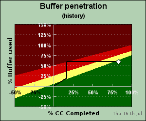
A common extension to the graph above is to also add a "historic" tail to the scatter point to show how it historically has moved. Adding a historic "tail" at day 8 would give the following penetration chart
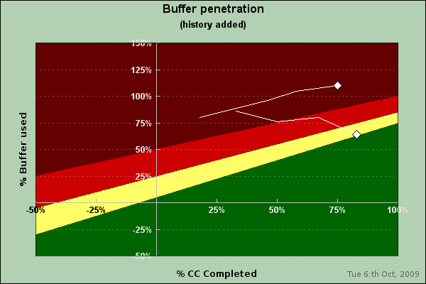
For an entire project these kind of "falling star" traces can be quite effective ways to see how tasks are progressing. We end this chapter with a final complete example (which uses the code we will develop in the following sections) to create a buffer chart for two tasks.
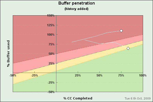
We can also use the alternative color map for this and get the result shown in Figure 31.5
The next section will explain in some details how to create a class that can mae these types of charts with an easy to use interface.
